/ Creating custom Power BI visuals to optimize UX: 1 concrete example with Deneb, HTML and SVG
Create of the visuals Power BI on measure For to optimize THE UX:1 case concrete with Deneb, HTML And SVG
Case study
Business intelligence
Power BI
Data visualization

Catalina Moreno
Share
At Ventriloc, we firmly believe that an effective dashboard should be much more than just a collection of charts: it should provide answers to our clients’ most strategic questions at a glance. Therefore, when a technical challenge arises, we don’t see it as a constraint, but as an opportunity to innovate. We are proud to share this case study where we pushed the boundaries of Power BI’s native visuals to deliver an elegant, maintainable, and highly functional solution.
The project involved designing a visual element not natively available in Power BI: a chart integrating sales, cost of sales (with a toggle to show or hide it), and a comparison with the previous period. The solution combined the flexibility of the custom Visual Deneb (Vega-Lite) with SVG and HTML-based techniques to enhance the user experience.
The customer’s challenge
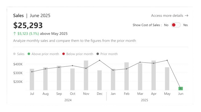
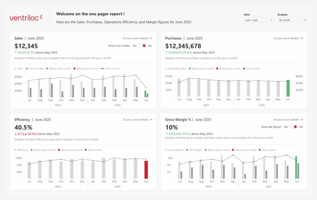
Our client needed to visualize four key performance indicators (KPIs) on a single page. The most complex KPI concerned sales; to simplify the explanation, we’ll use sales as an example. For this KPI, it was necessary to simultaneously display current sales and the cost of sales, while applying a specific conditional format only to the sales bar for the most recent month. Furthermore, the visual had to be interactive: the user needed to be able to choose whether or not to display the cost based on their analysis. This level of granularity (applying conditional formatting to only one series in a multi-series chart) was not achievable with the standard Power BI visuals.
The limitations of standard visuals in terms of conditional formatting
Power BI’s native visuals cover most analytical needs and already offer conditional formatting capabilities in tables, matrices, and simple charts. However, as Microsoft’s official documentation specifies, in bar or column charts, color rules are applied uniformly across an entire series, and not differentiated within a single visual.
In practical terms, when a graph contains several measures, it is impossible to condition only one of them according to a specific logic.
Rather than viewing this limitation as a hindrance, we see it as a deliberate architectural choice focused on clarity and simplicity. For more advanced use cases, Microsoft provides certified custom visuals in AppSource, such as Deneb, which offer a much higher level of flexibility. This allows you to combine the robustness of native visuals with the creativity and precision of advanced solutions.
Deneb at the heart of the solution
The core of the solution relies on a Deneb visual, defined using a Vega-Lite JSON file comprising:
- two bars: one for sales and one for cost (controlled by a toggle );
- a line with a dot representing the previous period;
- a conditional logic driven by a Field Parameter allowing switching between a monthly, quarterly or annual analysis.
The key element lay in the conditional formatting. The JSON incorporated a rule identifying the latest available period, which was colored green if sales exceeded those of the previous period, or red otherwise. All other bars intentionally remained a neutral gray, in order to immediately draw attention to the most critical information.
Add-ons with SVG and HTML
While Deneb formed the basis of the visuals, two complementary elements significantly enriched the user experience.
A dynamic legend in SVG
The legend was dynamically generated via a DAX measure returning SVG. It automatically adapted to the state of the sales cost toggle, ensuring perfect synchronization with the displayed graph.
💡 Tip:
To speed things up, you can use the Export SVG to Power BI plugin for Figma, developed by Ventriloc. It allows you to quickly convert SVG visuals into elements directly usable in Power BI, while reducing manual adjustments.
👉 Link to the Export SVG to Power BI plugin
An indicator of variation in HTML
A change indicator is designed in HTML to display the difference between current sales and those of the previous period, using arrows, colors, and percentages. Using HTML ensures precise and consistent visual alignment, even when text lengths vary.
Final result
The final visual is both powerful and flexible.
When the “Show Cost of Sales” option is disabled, the user sees only the sales bar with a simplified legend. When enabled, the cost bar and the full legend appear automatically. In all cases, conditional formatting highlights only the most recent sales period.
Thanks to this unique visual interface, the client can answer their main questions without cluttering the dashboard, while quickly accessing key insights. An ” Access more details” button also allows navigation to secondary reports for deeper analysis.
Conclusion
This project perfectly illustrates the added value of custom visuals, which proved to be the most relevant solution for this client, as for many others. At Ventriloc, we don’t limit ourselves to standard Power BI visuals: we fully leverage our advanced expertise to unlock the creative potential of these tools and elevate visualization to a whole new level.
This case confirms our belief: a dashboard must remain clear, precise, and designed primarily for the end user. By combining Deneb, SVG, and HTML, we transformed an apparent constraint into a genuine opportunity for innovation, delivering a unique visual within Power BI that now helps our client make faster and more informed decisions.